
The New Neutrals
We sat down with Little Greene Paint Company Creative Director Ruth Mottershead to explore the inspiration behind the brand’s 27 new shades, plus a curated Shopping Palette inspired by our favorites.
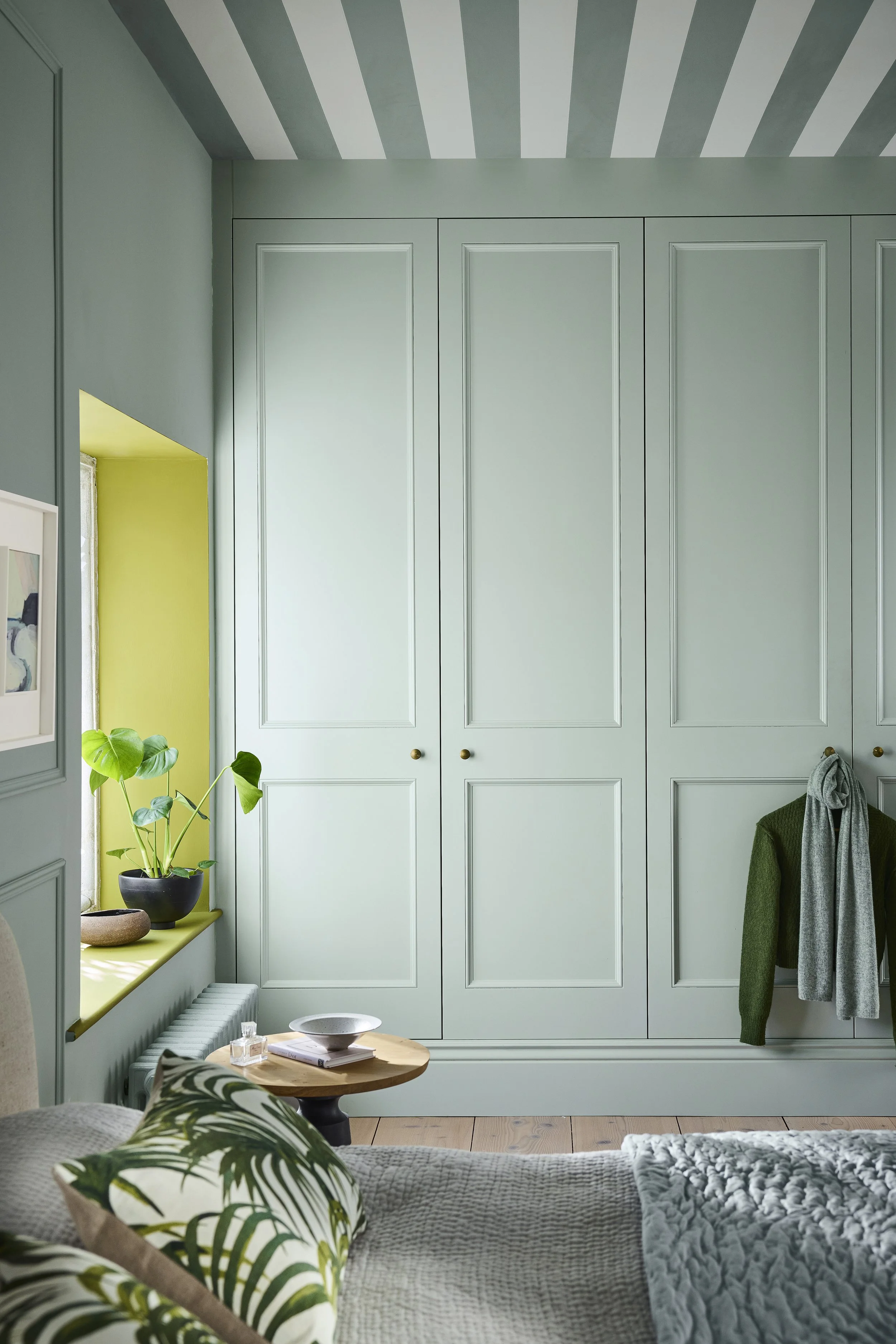
What changes have you been noticing in the way people are approaching color in their homes?
I'd describe it as an evolution rather than a revolution. We've moved through rich blues into teals, then softer neutral greens, then bold yellows that deepened into ochres and caramels, and more recently into stone-based neutrals and indulgent browns. Now we're seeing that warmth translate into burgundy, deep reds, pinks and aubergine, colors that bring real intimacy and a quiet sense of grandeur into a home.
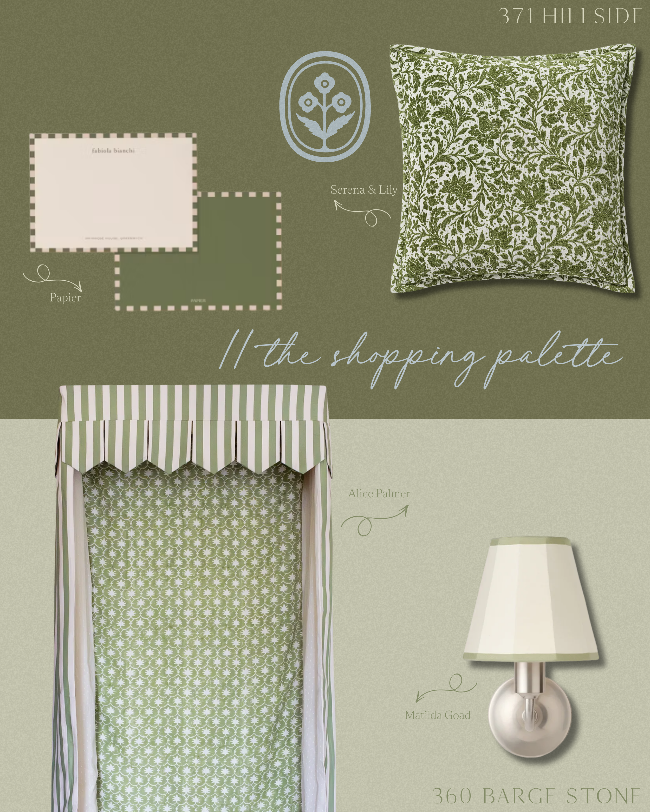
What do you think is behind the broader shift in color preferences right now?
I think it comes down to a deeper desire to feel connected to the natural world within our own homes, and a growing comfort with using color to create that feeling. There's a real appetite for spaces that feel soothing and considered that we enjoy spending time in.
What makes a color feel easy to live with?
Balance, really. If you think of undertone almost like a scale, the colors that feel easiest to live with sit right in the middle, neither too warm nor too cool. That's exactly what's driven the popularity of a shade like Portland Stone, and it's why we introduced Barge Stone, a wonderfully complex, easy-to-scheme neutral for exactly that reason. It's also about softening intensity. With a color like Ashes of Marigold, we've taken the heat out of a classic terracotta by tempering it with a touch of black, so you get all the warmth and character without it feeling overwhelming.
How do you use a pastel in a room without it becoming too precious or overpowering?
The pastels we're drawn to at the moment aren't too sweet. They're gentle, characterful gelato tones like Floss, Parlour, Boxington and Celestial Blue, and what makes them work is that they still have depth and personality behind the softness. I'd always recommend using them within a family of related tones rather than in isolation, so pairing Hammock on a ceiling with Flight Pink on the walls, for instance. That relationship between shades is what keeps a pastel feeling more sophisticated.
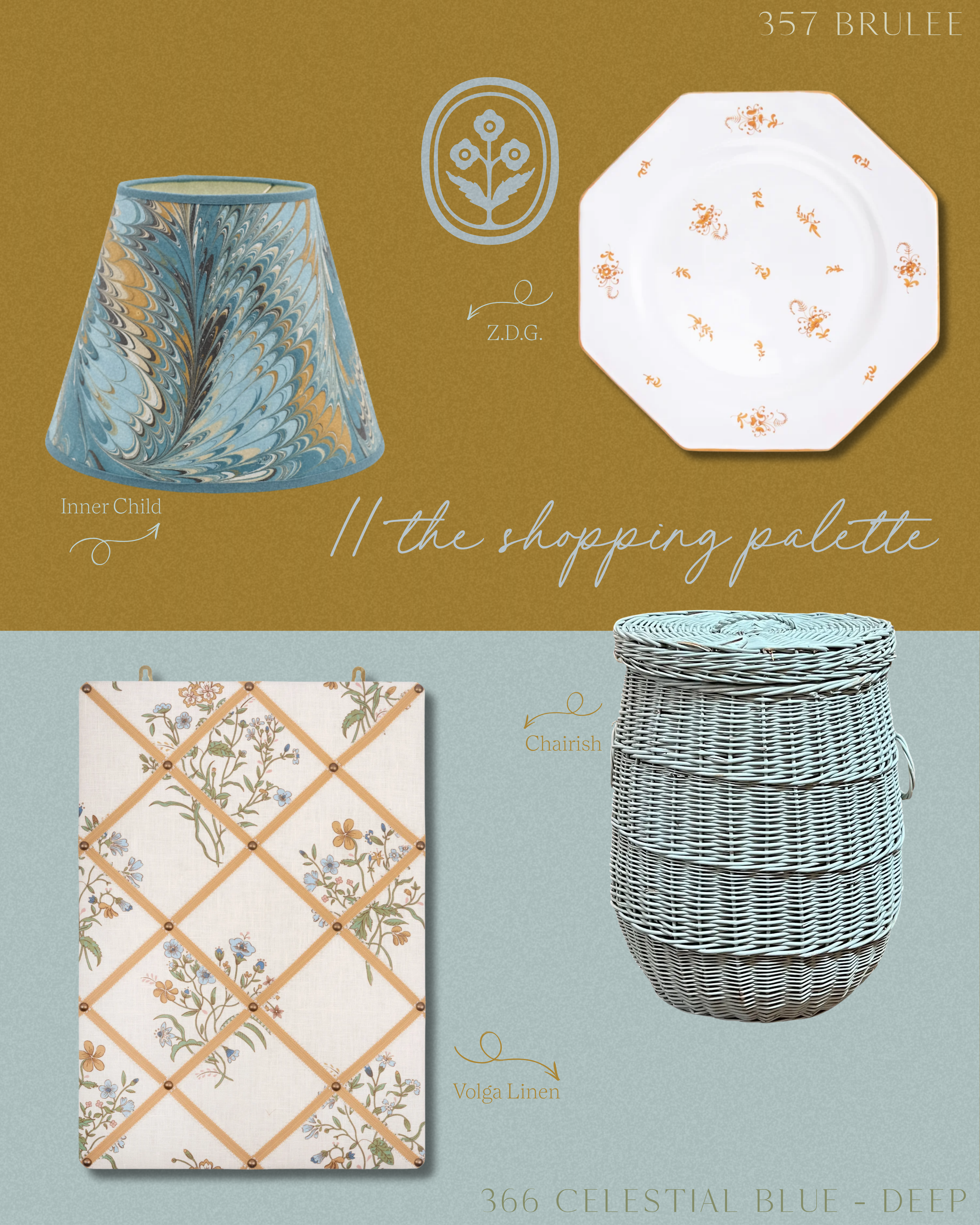
How do you decide whether a room calls for a warm or cool color?
It really comes down to the light the room actually receives. A north-facing room with cooler, flatter light can feel wonderful with a warm color to counteract that chill, while a south-facing room that's flooded with sun can sometimes handle a cooler tone without feeling cold. I'd also think about when the room is used. A dining room used mostly in the evening under lamplight will read very differently to one used for breakfast in bright morning sun, so it's worth testing your sample at the time of day you'll actually be in the space.
What’s your favorite color from the new collection? Where would you use it?
I'm particularly drawn to Perpetual Blue at the moment. It's intriguing and expansive, and I love how it can shift depending on the light in a room. I'd use it somewhere you want a little quiet drama, perhaps on cabinetry or a vanity unit, paired with a warm, earthy neighbor like Ashes of Marigold so the two juxtapose and create design interest.
What should you consider about a room before choosing a paint color?
I'd always start with how the room is used and the atmosphere you want to create, rather than the color itself. Is it a space for relaxing, or somewhere busier and more energetic? From there, look at what's fixed and won't be changing, your flooring, any tiling, existing furniture and soft furnishings, and consider those within your scheme. Proportions and ceiling height matter too, a low ceiling or a small room can take a bold color beautifully if the rest of the scheme supports it. Choosing with longevity in mind, rather than following a passing trend, will always serve you better in the long run.
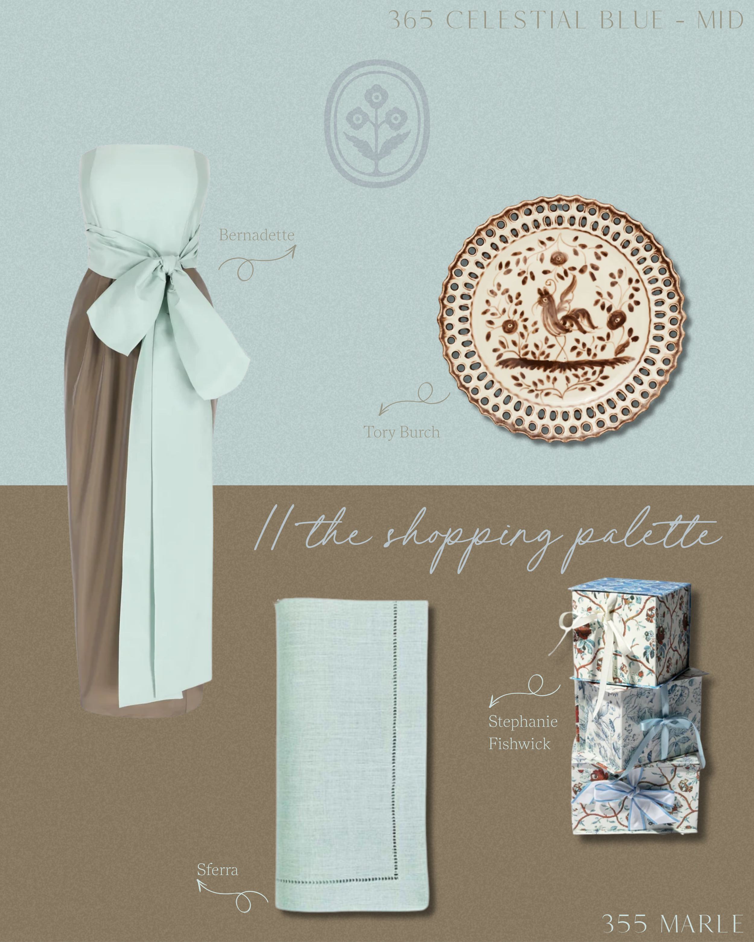
What’s one mistake you see people make when choosing paint color?
Painting trim, skirting and ceilings white purely out of habit. It's such an easy default, but it interrupts the use of color and draws the eye in a way that limits the enveloping, cohesive feeling a good scheme can deliver. I'd always encourage people to think about the ceiling as the fifth wall of the room rather than an afterthought.
What’s the best way to test a paint color before committing to it?
Always test a sample pot in the room itself, in its own lighting conditions, and live with it for a few days if you can. Color changes so much depending on the light at different times of day, and our formulations in particular have a real depth that reveals itself differently morning to evening. It's a small extra step, but it gives you the confidence to commit properly rather than guessing from a swatch on a card.
Where do you see interior color heading next?
I think we'll keep seeing that progression of warmth continue, moving further into burgundy, red, pink and purple as people grow ever more confident with color. The popularity of mid-tone colours continues to rise, they can bring real character to a space without feeling too intense or overpowering.
